2025
Services
UI / UX design
Figma
FigJam
HTML / CSS
Javascript
Visit website
butiksylvana.pl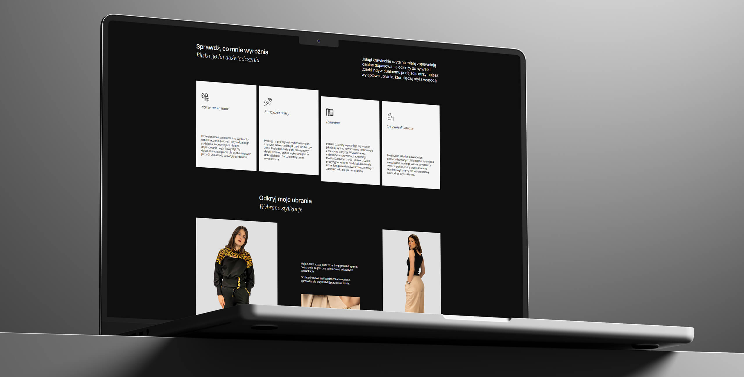
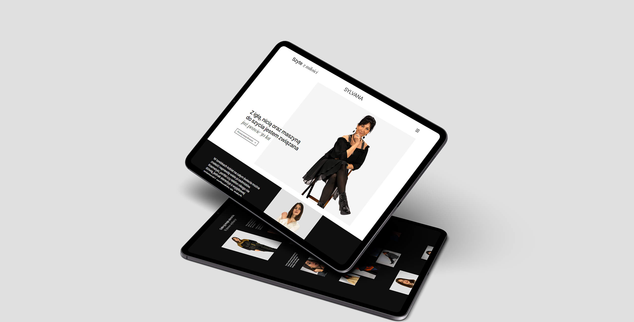
Section with highlighted features of the company and its services
Project overview
Sylvana is a company with nearly 30 years of experience in the tailoring industry, run by a person passionate about sewing. The owner’s designs combine style and comfort, relying exclusively on Polish knit fabrics. The scope of operations includes work for both individual clients and larger and more known clothing brands.
Goal
The main goal was to create a one page style website to do a presentation of the company and to expand business by creating an online shop. An important aspect of the design was to highlight and showcase the portfolio using professional photos. Additionally, it was necessary to include full contact details along with links to social media to strengthen the company’s online presence and inform users about its online activities.
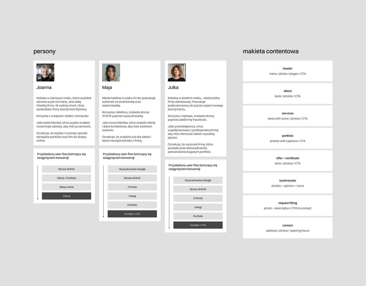
Personas and example user-flows with conversions, content mockup
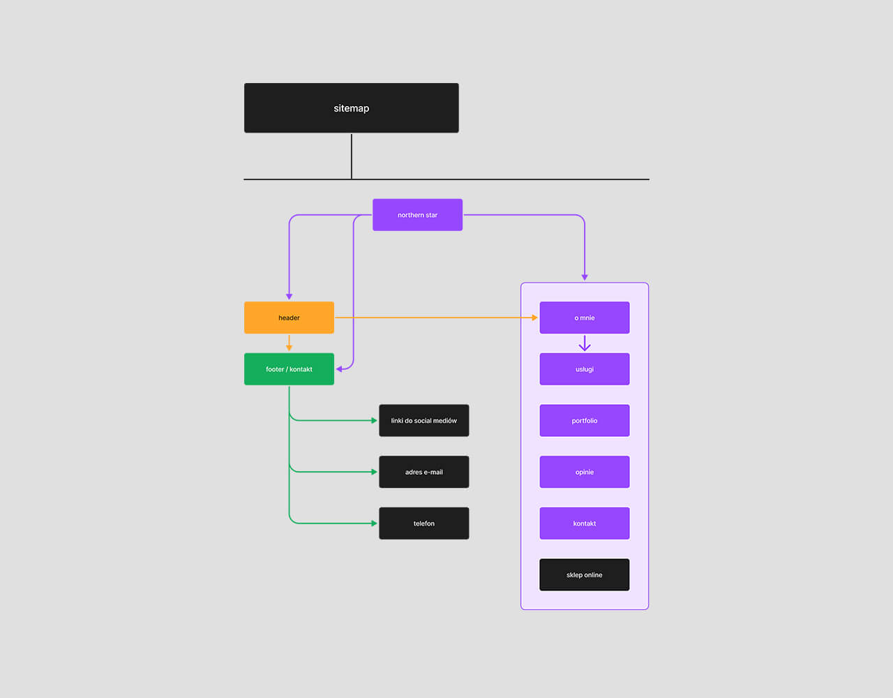
Visualisation of the site map
UX
The three created personas, along with user flow, helped to create a short and seamless path for users to follow, ensuring smooth navigation leading to conversion (such as accessing the online store, finding contact details, or exploring the company’s offer and portfolio).
The creation of a content mockup helped to identify the potential issues in the design (e.g., incorrect module order, which disrupted navigation and blocked access to key information). The mockup also helped in planning the functionality, layout, and visual appearance of the website.
A simple site map allows users to quickly and logically switch between sections, find the information they are looking for, and group elements effectively. This resulted in the creation of an intuitive navigation path.
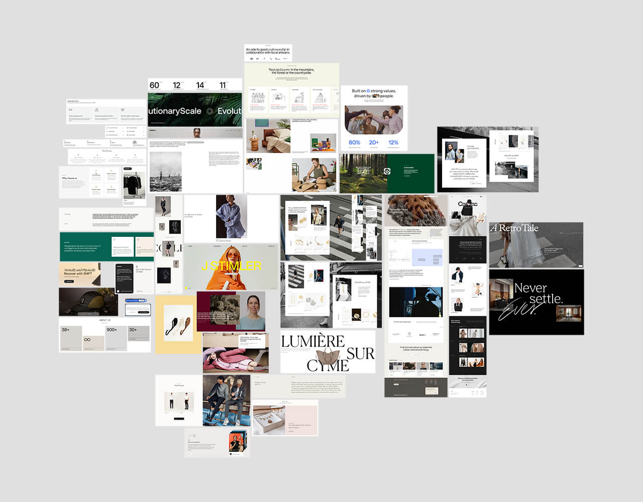
Moodboard inspired by the fashion industry websites
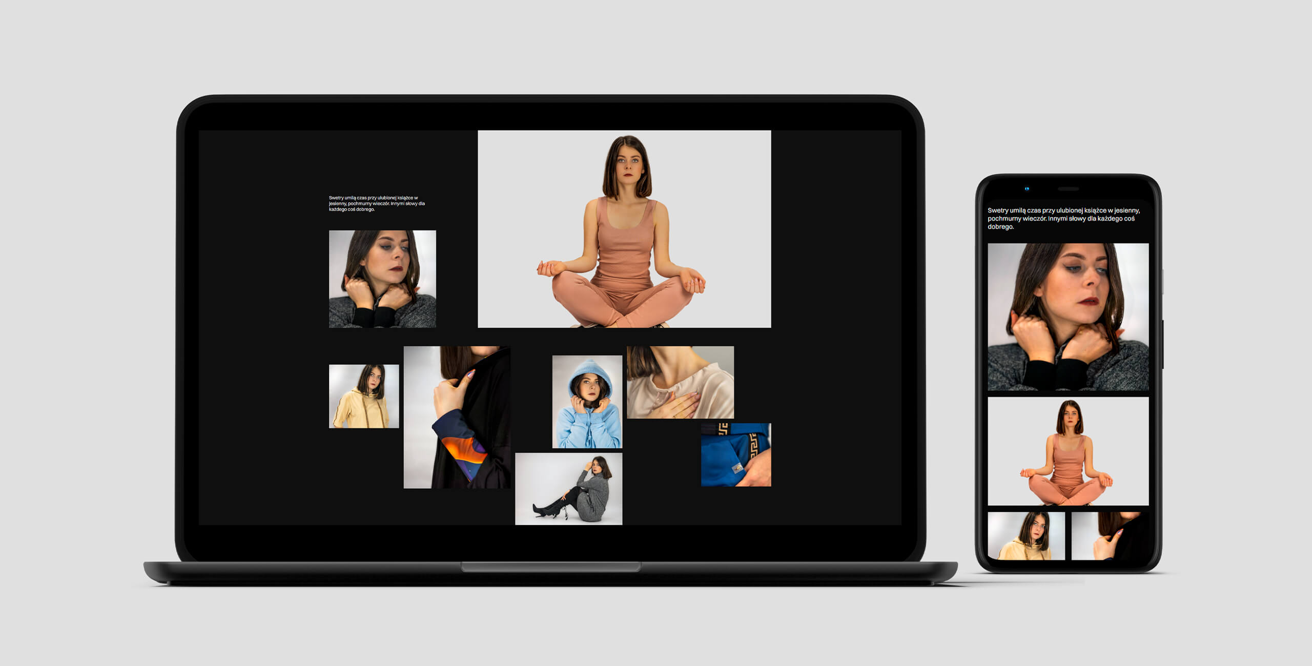
Responsive layout of the portfolio section
UI
The main goals of the UI efforts were: building the brand's visual identity, designing the interface with the target audience in mind (women), and optimizing for both responsiveness and clarity, as well as guaranteeing intuitiveness.
The entire design was created using a simple color palette (grayscale) and is based on a 12-column grid.
For typography, two fonts were used: Switzer and Boska. The first one is a neo-grotesque, classic and timeless font that perfectly aligns with the brand's identity. Boska was used as an accent, primarily for headings, thanks to its high contrast and calligraphic touches.
The mood board helped to quickly determine the stylistic direction, drawing inspiration from the fashion/clothing industry. Additionally, the visual style was aligned with the company's branding to ensure a cohesive look across the brand's other projects.
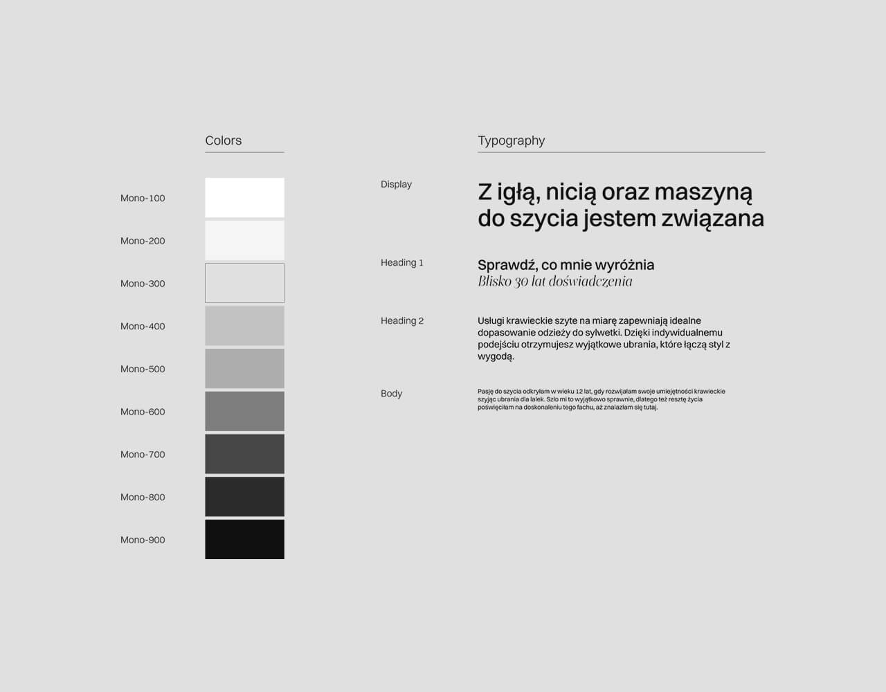
Color palette and typography
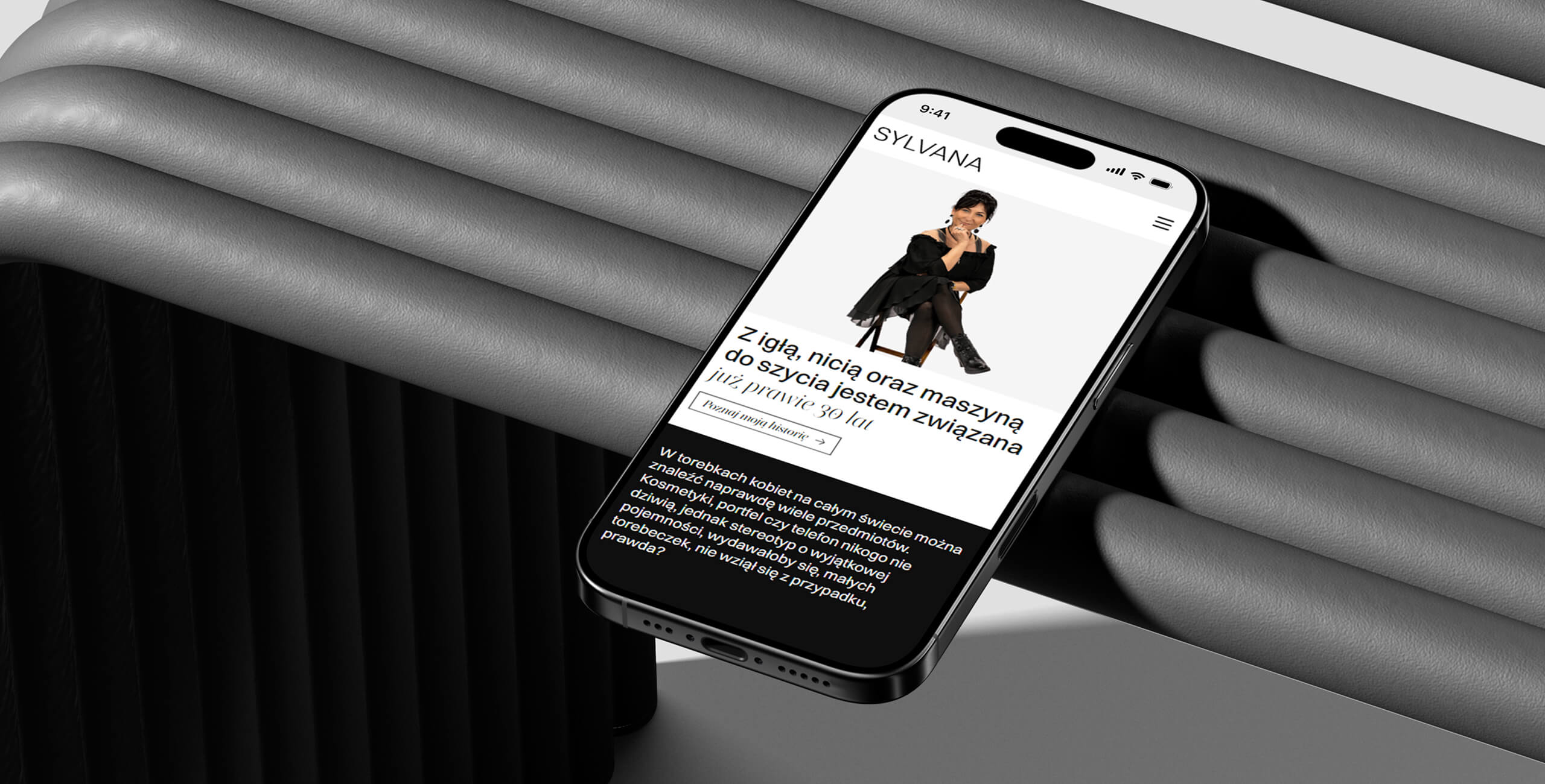
Mobile view header
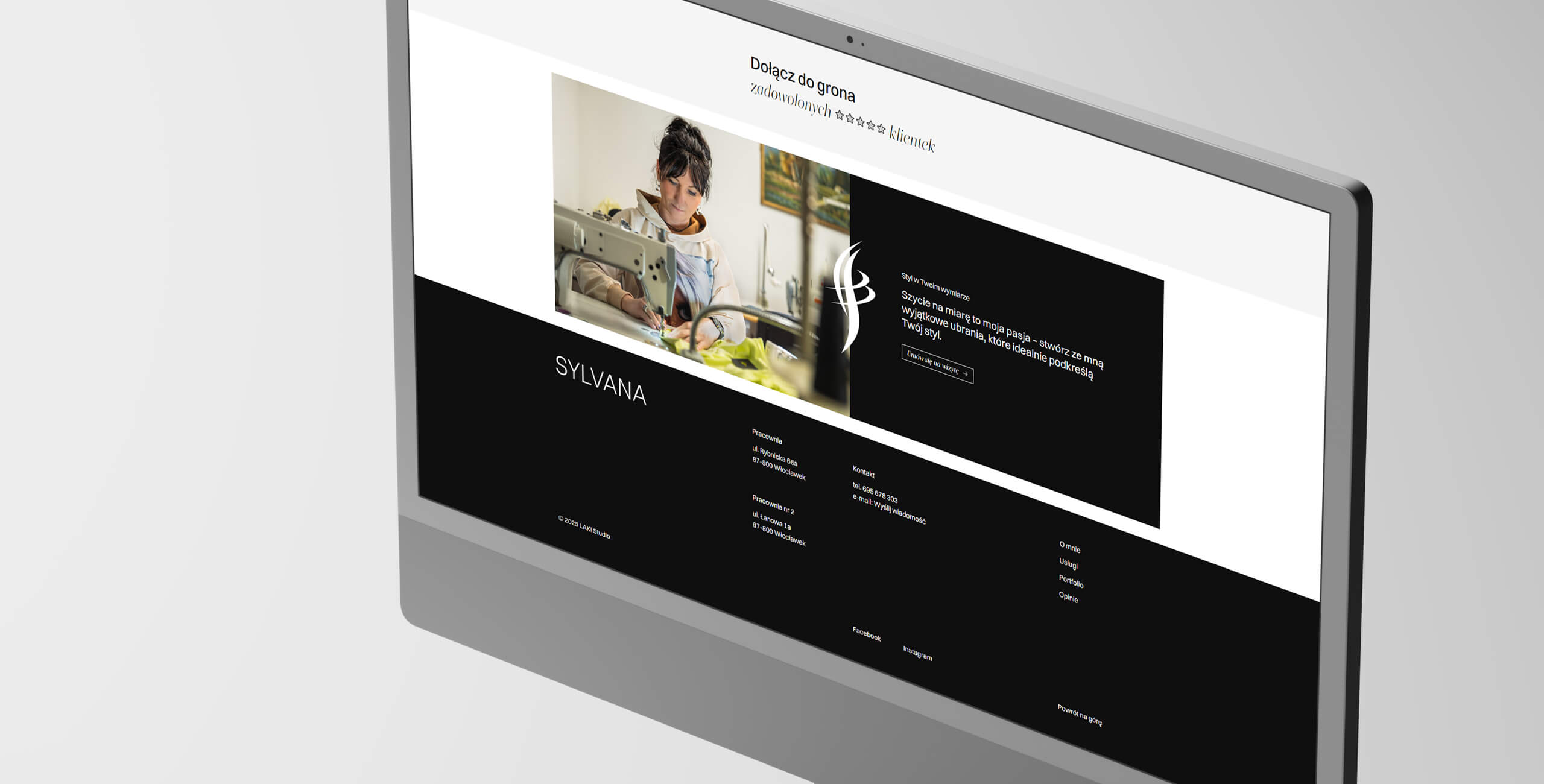
View of the bottom part of the website including footer
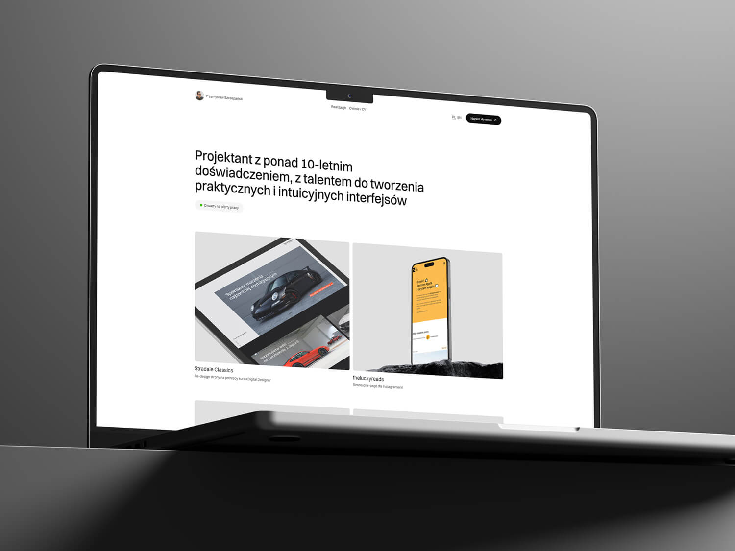
Design and implementation of my own portfolio from scratch
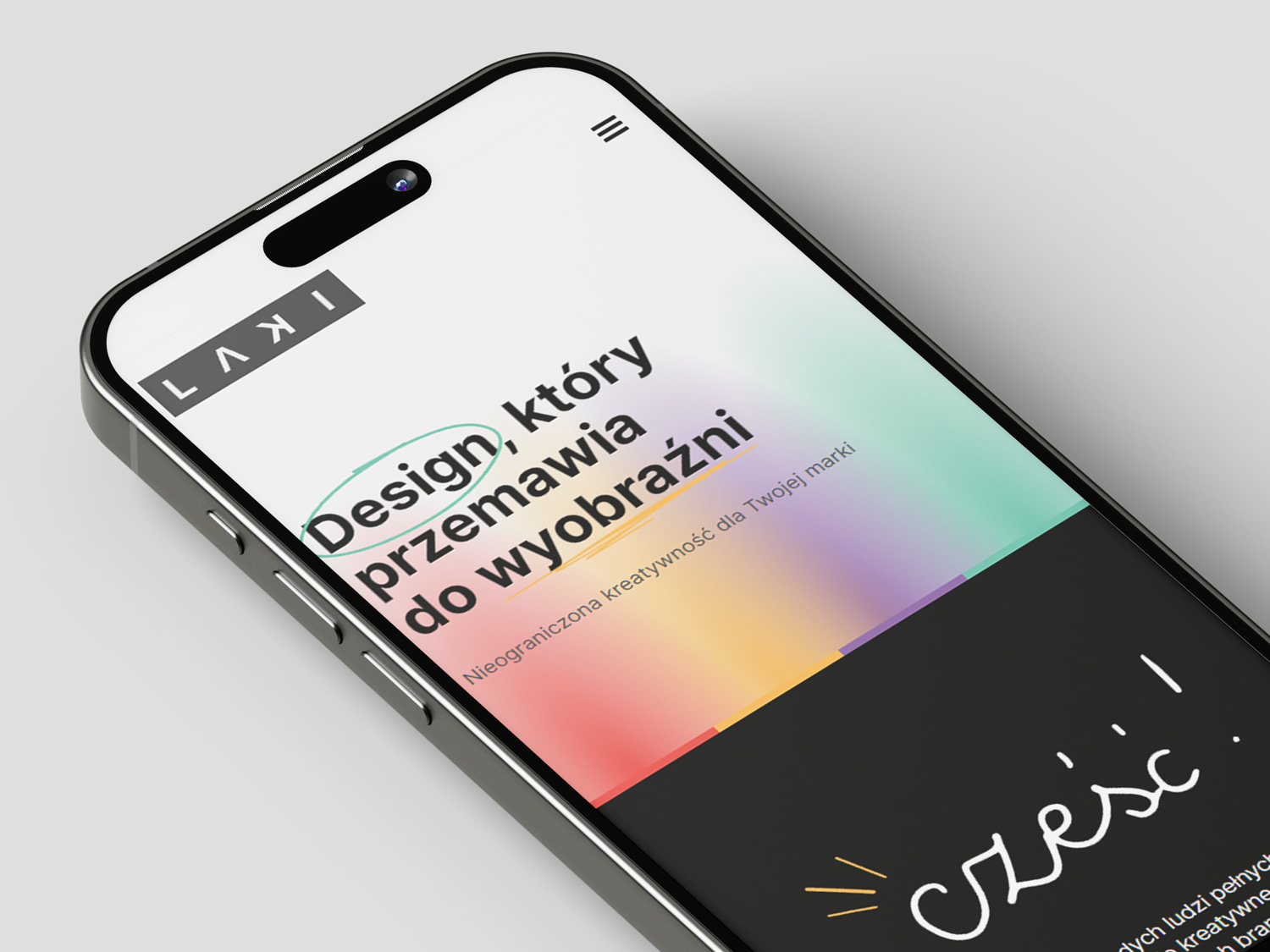
Portfolio design for creative studio
